Dark Theme, Activity Detail and more
Team Hellotime · Mar 29, 2024

👋 Hello, Our journey to build a better resource planning app for client work continues. We're adding new features and working on improvements under the hood. Here are the latest updates.
Let's begin!
- Dark Theme and UI tidy-ups
- Activity detail
- Better workload widget
- Improved mobile experience
- Getting solid under the hood and privacy update
Dark Theme and UI tidy-ups
When you have to develop new features, you sometimes have to hurry. However, we want Hellotime to be a well-made product, and that its look & feel always be of excellent quality. That’s why, after months of work, we stopped and reviewed the entire UI.
We’ve rebuilt the entire design system to make it more consistent and better organized. There was no upheaval as the UI language remained the same. However, some may have noticed improvements in details, animations, and interactions. We also added dark mode, to be consistent with our vision of a modern, well-made resource planning app that adapts to the preferences of those who use it.
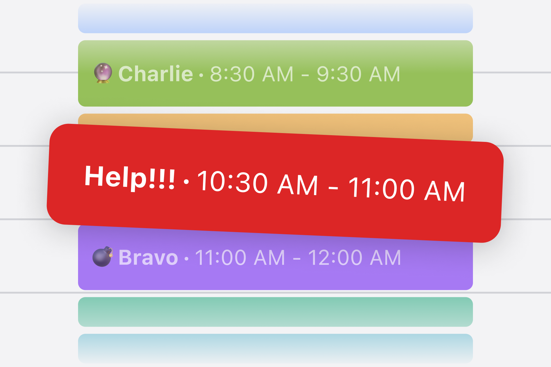
Activity detail
Both in our experience using Hellotime and through user feedback, we felt something was missing from Hellotime. We’re building a resource planning app, so we should not go into the details of a project’s tasks. However, a project involves different activities that sometimes takes months.
So, we decided to introduce a new feature: the activity detail. It is actually a rather flexible tool. We use it, for example, to specify the type of activity a person will perform on a longer project, such as “Design”. Or, when working in agile sprints, to specify the number of the current sprint and track the evolution (e.g., Sprint 1, Sprint 2, and so on).
Better workload widget
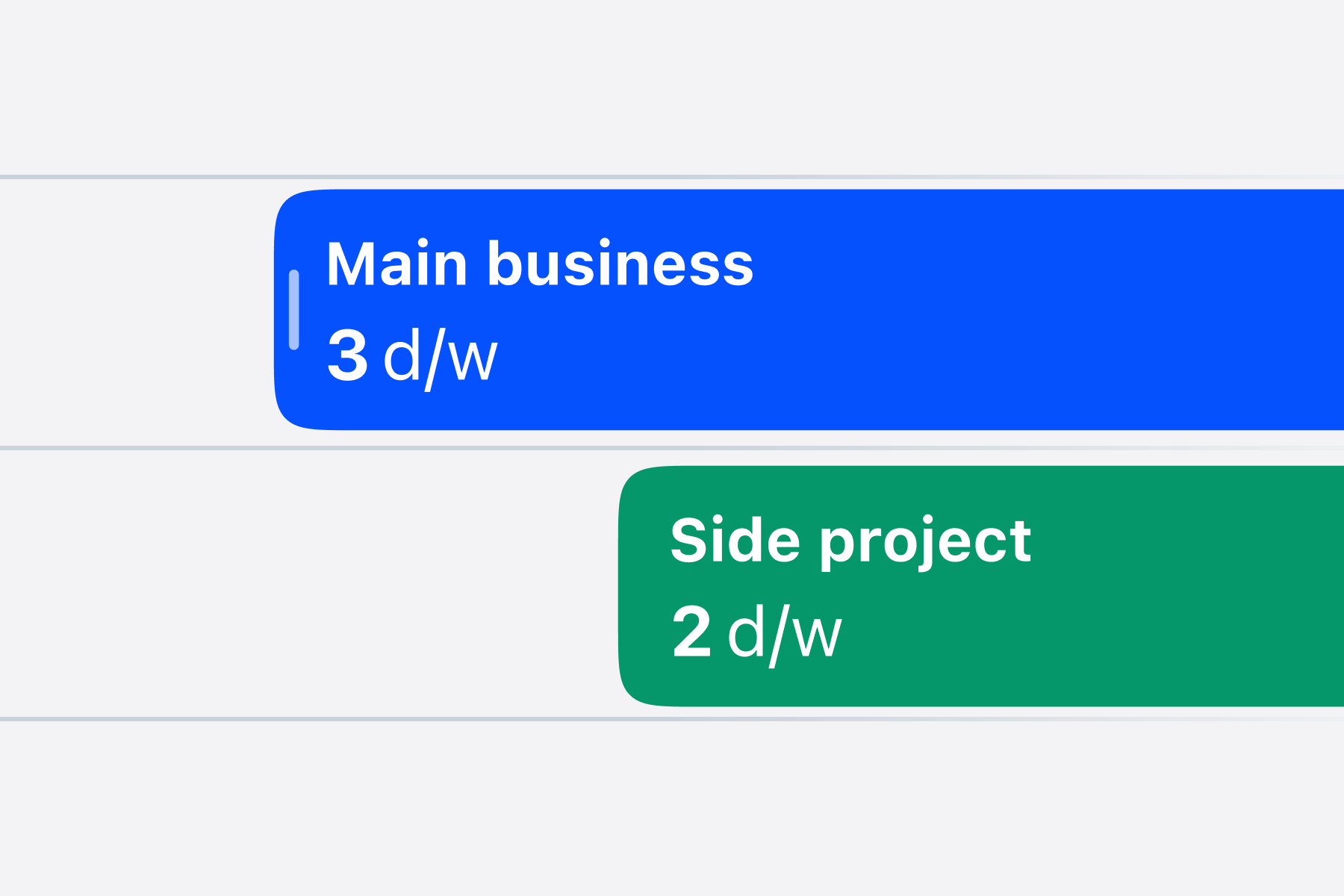
Insights are among the eye-candies of Hellotime, offering a way to gain a comprehensive overview of the company’s resource planning. The first two graphs displayed the trend over time in the number of projects and their utilization. “Utilization” rate is a term indicating how much, in percentage, team members are busy relative to their availability. These two graphs showed a rather similar trend, making the interpretation of each less immediate than we desired.
We want Hellotime to be a tool that drives resource planning beyond just checking numbers and percentages. Therefore, we’ve transformed the utilization chart into a more user-friendly widget. This chart now provides quicker information on the workload status for the upcoming weeks.
Improved mobile experience

Hellotime is a resource planning software that, by its nature, requires a highly interactive user interface. Over time, adding features, we had, however, neglected a bit the consistency of the UI in mobile mode. Some users rightly pointed this out to us. So we got to work to make the mobile version of the resource planning timeline easier to use.
Getting solid under the hood and privacy update
This month, we’ve dedicated a considerable amount of time to enhancing the application’s reliability and robustness. Specifically, we’ve developed a queue and background job system (which, in technical terms, do not block the main application thread). The first application of this backend and infrastructural component has been in creating our internal audit log system. This is important for security and reliability, aspects we deeply care about. The queue and background job system will be used for much more in future, such as offloading heavy computational tasks when the volume of user sessions increases.
For this reason, we have updated our privacy policy to include two backend services we employ: Redis Cloud and MongoDB Atlas.
You can read the last version of our privacy policy here.
Last but not least: our blog
Last but not least: Hellotime blog This month we’ve launched Hellotime blog on our website. It’s a place where we’ll share lessons learned, our opinions and product updates. Our first article, about building a side project as a creative studio, hit Hacker News front-page.